Iconic Incense Brand, Triloka, Gets an Upgrade
Triloka Incense, a longstanding brand with a commitment to ethical sourcing and mindful practices, faced a challenge in a highly competitive and trend-driven incense market. Their packaging lacked a cohesive visual identity and struggled to resonate with a modern audience.
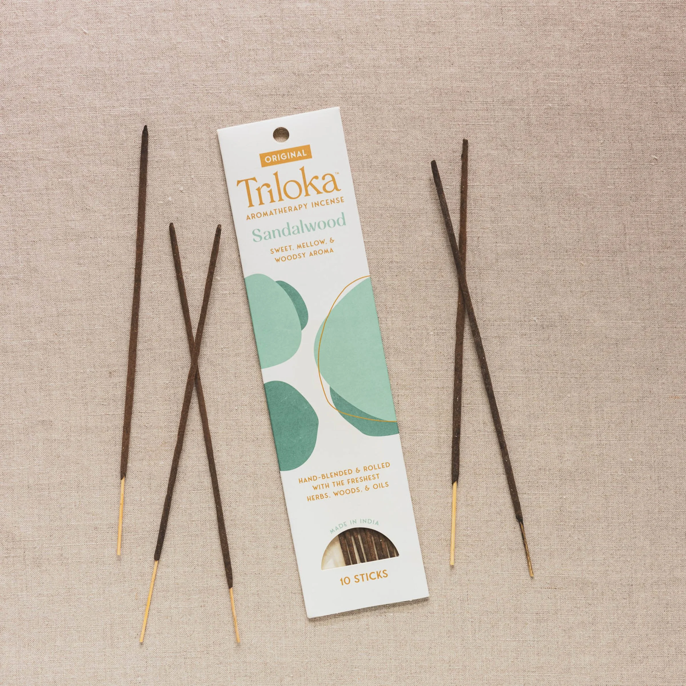
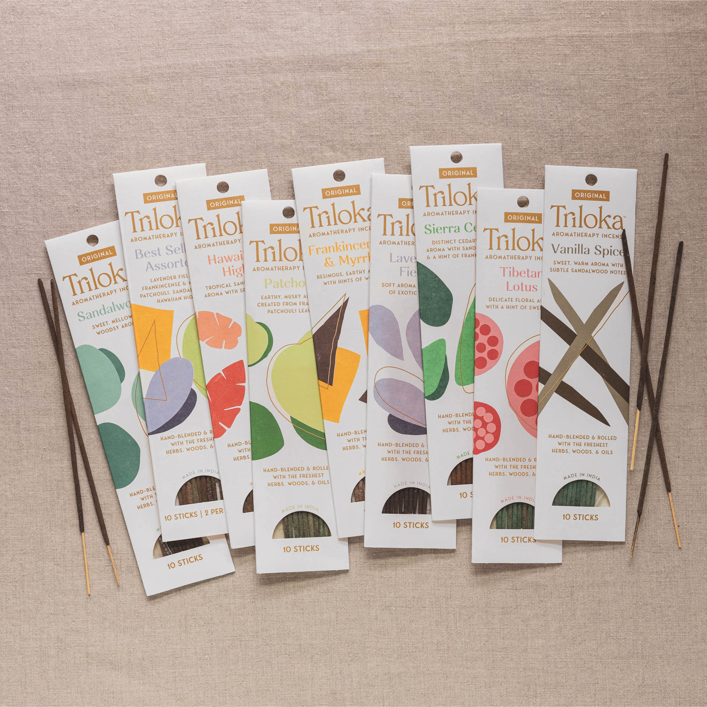
Partnering with Shelf Studio & Rachel Landers Creative Studio, Triloka embarked on a strategic packaging redesign. The new architecture prioritizes a tactile and visual experience, setting Triloka apart from other brands. Lighter packaging adorned with hand-drawn, abstract illustrations conveys the artisanal nature of the products.
Triloka's story, rooted in ancient practices and mindful sourcing, is woven into the packaging design. The system emphasizes the brand's commitment to intentionality, purity, and global responsibility. This authenticity resonates with consumers seeking genuine experiences and ethical products.
As a category leader, Triloka offers a wide range of incense products, including original, premium, Ayurvedic, Angel, and many more. The new packaging system ensures clear differentiation, allowing consumers to quickly identify their desired product within the crowded market space.
Shelf Studio and Rachel Landers Creative Studio, two woman-led boutique agencies specializing in CPG brands, played a crucial role in Triloka's successful packaging redesign. This collaboration resulted in a modern, impactful visual identity that celebrates Triloka's rich heritage while effectively communicating its unique selling points to a modern audience.


