
Plucky Pickle Dip
Objective
Plucky Pickle Dip approached us at a crucial point in their growth. With a devoted following and a product line featuring irresistibly tangy, pickle-forward dips, they were prepared to expand their market reach. We were tasked with reimagining the Plucky Pickle Dip brand to help it stand out on shelves, online, and in the hearts (and fridges) of adventurous snackers.
We took a full-spectrum approach to Plucky Pickle Dip’s rebrand, focusing on strategic storytelling, elevated visuals, eye-catching packaging, and digital performance. Every touchpoint was intentionally designed to capture the product’s playful edge and premium quality.
Capabilities
Logo & ID Systems
Packaging
Website Design & Development
Photography
Illustration
Copywriting
Print Collateral
Promotional/Swag
Digital Ad Campaigns
Digital Collateral
Email Marketing
Tradeshow
Voice & Tone

Plucky Pickle Dip was born out of a love for all things pickle. A bold, zesty, crunchy, spreadable delight crafted from real dill pickles, savory spices, and a creamy blend of cream cheese and white beans.


We art-directed and produced vibrant and bold photography that brings Plucky Pickle Dip’s bold personality to life. Our focus was on capturing the product’s zesty appeal and versatility—showcasing it not just as a dip, but as a flavorful ingredient for snacks, meals, and everything in between. The final imagery strikes a balance between playful and premium, and is used across the brand’s website, social media, email marketing, and digital campaigns to create a cohesive, crave-worthy visual identity.


To support Plucky’s growth and capture more attention in competitive refrigerated aisles, we evolved the packaging to better reflect the bold, crave-worthy nature of the dips inside. The refreshed design features an elevated yet playful color palette and enhanced pickle characters that lead with flavor and personality. The result is a vibrant, eye-catching system that amplifies brand recognition, communicates product appeal at a glance, and brings a joyful, unmistakably Plucky presence to both shelves and fridges.


We evolved Plucky’s signature pickle characters into a more expressive, flavor-forward illustration system—designed to boost visual recognition, enhance shelf impact, and create stronger associations between each character and its corresponding dip. Each illustration was refined to reflect the unique personality of its flavor profile, helping shoppers instantly connect with the product in both physical and digital environments. These custom assets now serve as a core brand language element, seamlessly extending across packaging, website, social, and swag—building brand recall and adding a layer of playful storytelling to every touchpoint.
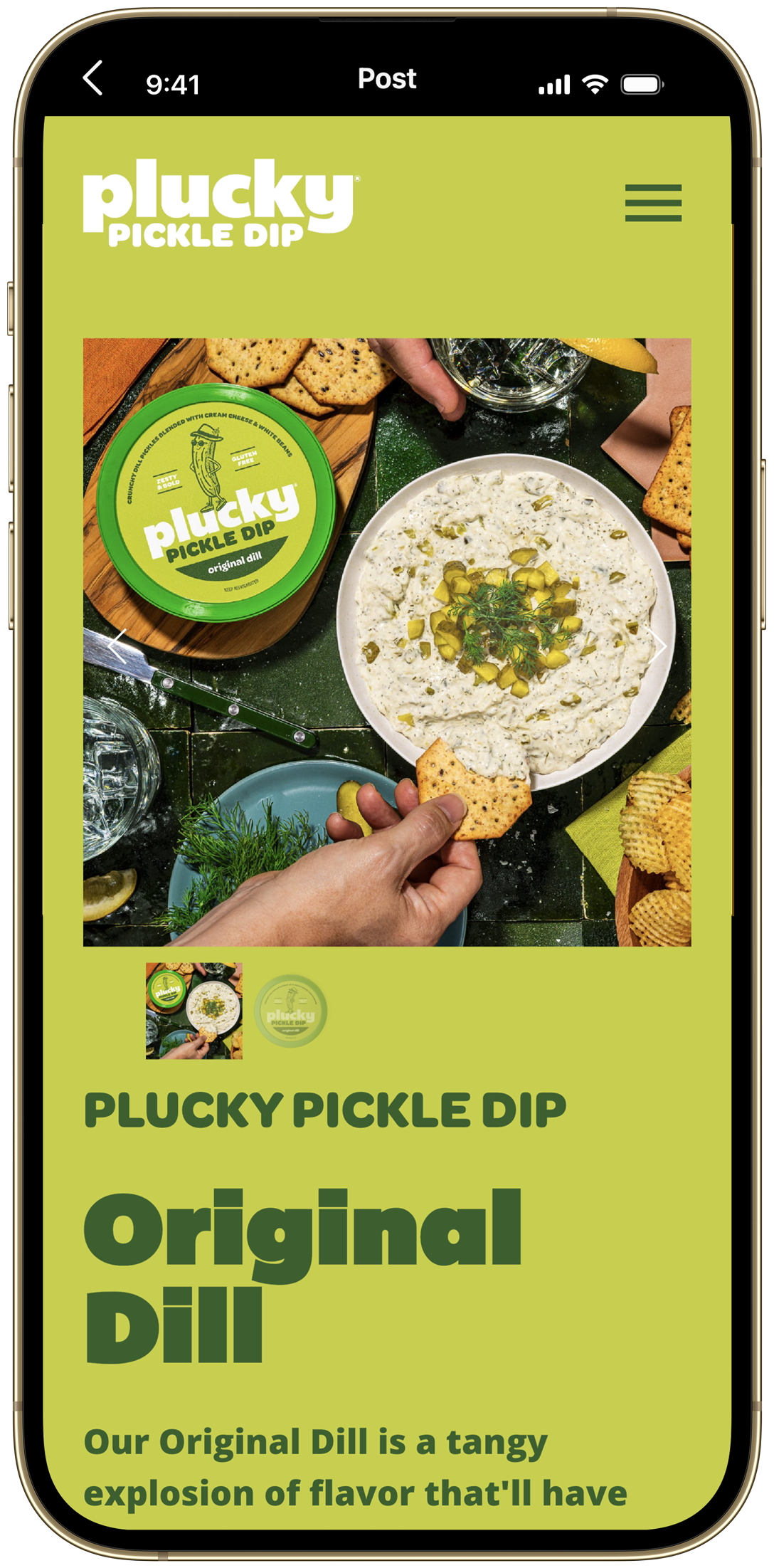


Plucky’s rebrand called for a digital experience that could carry the energy of the new identity while supporting growth and conversion. We designed and developed a fully responsive, content-rich website that strategically integrates brand photography, custom illustrations, and bold color to create a cohesive, immersive environment. The architecture is streamlined for usability and product discovery, with clear pathways to finding the product, storytelling moments throughout, and is also scalable as Plucky grows. The result is a highly engaging platform that captures attention, builds trust, and converts.

Before

After

Before
After

Before
